Case study · CDI · Brand refresh

50 years of trust.
Finally, a brand that shows it.

[Shannon's testimonial: one or two lines on what changed, in her words.]
Shannon GrosserCEO, Computer Deductions, Inc.

The problem

A new offer. An old look.

For more than 50 years, CDI has built and supported systems for California DMV programs, law enforcement, and federal and state agencies. Its staff hold security clearances. Few IT firms know these systems. Fewer have supported them for five decades.

CDI was launching managed IT and cybersecurity for the agencies it already serves. But its logo, website and LinkedIn still said "product vendor." Nothing told an agency that CDI could also run and protect its IT.

A buyer can't pick you for a service they don't know you sell.

My approach

Keep the trust. Show the new work.

01 Find the proof A kickoff with CDI leadership on the new offer, the buyer and the proof: years in market, clearances, contracts and the CLEW, JCTMC and QuID Plus products. Why: Public sector buyers check everything. The brand has to show proof, not adjectives.
02 Two logo paths A refresh of the old three-ring mark and a new mark. CDI chose new: a fingerprint C with a red scan dot. Why: The mark should say what CDI does: check identities.
03 A full brand kit Colours, fonts, logo files for every use and the rules. Navy for the brand, red for the one ask. Why: Rules let the team stay on brand without a designer.
04 A site with two routes Nine page designs: public safety products on one side, managed IT on the other. One button everywhere: Request a Consultation. Why: New services get room without hiding the product business.
05 LinkedIn to match Company and personal banners in the new brand, plus PDF brand guidelines. Why: Buyers check LinkedIn before they call. It should look like the same company.
The turning point: CDI's products check identities: fingerprints, IDs, records. So the logo became a fingerprint with a scan point. The brand now says what CDI does before anyone reads a word.

The website

From product vendor to partner agencies trust.

Before
The old CDI homepage at cdi-hq.com

cdi-hq.com. Stock circuit board, three-ring logo, one button that says "Learn More." Nothing about managed IT.
After
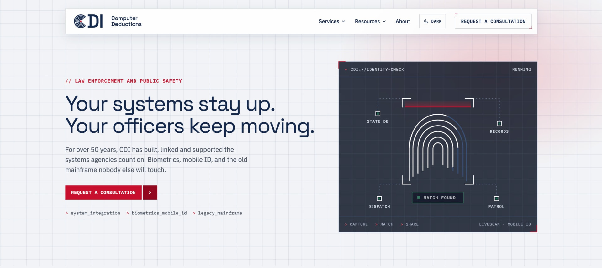
The new CDI homepage: Your systems stay up. Your officers keep moving.

The new homepage. Says who CDI serves and what it does in one line. One red button: Request a Consultation.

The brand kit

Careful people. Still here. Now it shows.

Before
The old CDI three-ring logo

Three rings and a script wordmark.

After
The new CDI fingerprint C logo

A C drawn from fingerprint ridges, with a red scan dot.
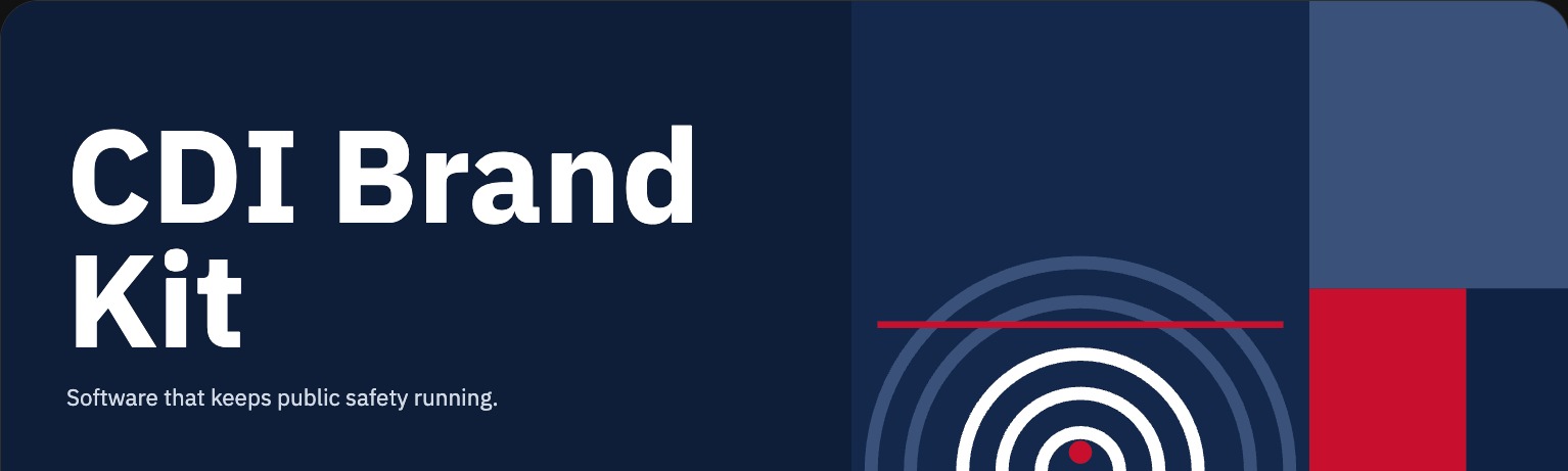
The CDI brand kit cover
The full kit. Logo files for every use, colours, type, spacing and the rules, in one place the team can use without a designer.
Colour
Navy#14284B · The brand
Signal red#C8102E · The one ask
Mist#F1F4F7 · Backgrounds
White#FFFFFF · Cards
Type Software that keeps public safety running. IBM Plex Sans for everything. Plain, sturdy and easy to read on a procurement form.

The result

One brand. Two clear offers.

1 new logo The fingerprint C, with a red scan dot.
1 full brand kit Colour, type, logo files and usage rules.
9 website page designs Home, three service pages, case studies, blog and About.
2 LinkedIn banners One for the company page, one for leaders.
1 brand guide PDF For vendors, printers and new hires.
BeforeEvery proposal, one-pager and post started from a blank page. Leaders spent hours explaining what CDI does on calls.
AfterThe team builds on-brand material from a kit, no designer needed. The site answers the basic questions, so calls start with the real ones.

An agency buyer can now see both sides of CDI in one visit: the public safety products and the managed IT. Every page asks for one thing, a consultation, through the same five field form.

The old logo has retired. It earned it.

[After launch: add consultation requests per month and LinkedIn growth.]

Stop explaining your business.
Let your brand do it.

A 30 minute call about your business. No pitch deck.